What is the purpose of the document?
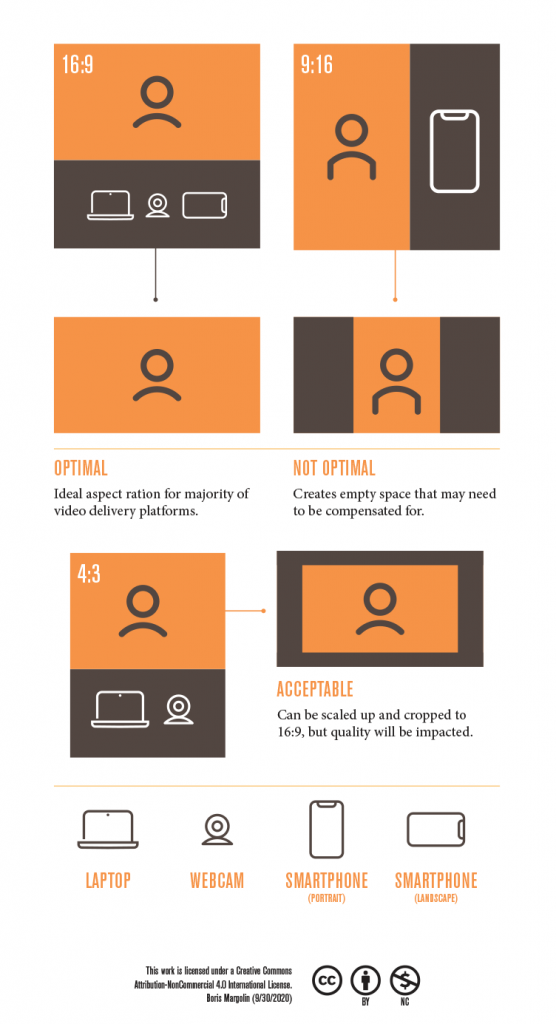
The purpose of this document is to be a cheat sheet and to help students visualize how some common devices record video. The document also serves as supporting visual elements that would be used the development of a course.
What are the needs of the audience (students)?
The audience in this case may be unfamiliar with the importance of aspect ratios in video production. For example a video shot in portrait mode becomes a challenge to work with and create an unfamiliar experience for viewers accustomed to full screen video. The best way to explain this is visually.
What colors should you use and avoid?
My goal in using this for the course I intended to develop is to establish a cohesive visual treatment. The icon styles, colors, and layouts should all reflect that consistency. The colors I used are high contrast and compliment each other. I did however choose to refrain from using a blue color way so as not to give the idea that the images or text are clickable.
How to integrate images and graphics effectively?
I used a simple style that can communicate quickly and also allows me to expand when necessary. Keeping things in a vector format also allows me to create SVG assets for use in the development of the course and any interactive or supporting elements.
Visual Design idea from this week’s lecture: and Contrast, Repetition, Alignment and Proximity.
Icons tend to create their own visual language. By focusing on the repetition of those icons will allow for their reuse throughout the course. I included the bottom ledged as a catchall element and to help balance out the document.
Additional notes:
As with most icon design it helps to keep things simple. Technological elements, for the most part, tend to be universally recognizable. However when designing your own icons it helps to conduct some user testing. I ran through a couple variations before I was happy with the “first glance” results. However the webcam icon did not test well with “younger users”, but was quickly recognized by “older users”.